
- Internet
- 09.04.2019
- EN
Manuel Schnitger: Sneak Preview "Mobile Preview in WSM 11.2"
written by Manuel Schnitger, 23. April 2013

Oldenburg, City Center
Recently I’ve been in Oldenburg (Germany) again and heard some news regarding version 11.2 of the Management Server. Next to lots of other cool features the Management Server 11.2 will provide a preview for mobile devices (phones/tablets). The reason why I find this very important is the likelihood of having more and more mobile web sites in near future. Some years ago mobile web sites have been a nice “add-on” in regards to the web presence. Organizations were able to show to the audience that they use state-of-the-art technology but at the end of the day not too many people really used smart phones. Nowadays almost everyone uses a smart phone or tablet pc….and consumes tons of information via those devices. As a result, the option to have a preview covering these devices is vital for all companies that use a WCMS to create their web site. Without a proper preview it’s hard (or nearly impossible) to see the web pages in the same way as users of those devices do and without control ….the user-experience will probably not increase ;)
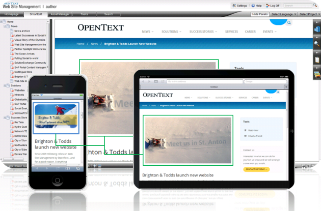
Preview for mobile devices
On the above displayed screenshot we see the normal preview in SmartEdit, the preview for a tablet pc (resized but looks the same as the normal one) and for a smart phone. The difference between the preview for the smart phone and the other ones is that a different image is used. And here the importance of a preview for mobile devices is getting clearer ;)
Just a few examples of things that might be different on mobile devices…
- Logos
Of course it’s a good idea to resize the original logo (or chose another similar one especially if there is a text used within the logo that needs lots of space)….saves space and no one is really interested in an oversized logo with the text:”Company xy, the cradle of intelligent and effective software design!” - Search
Not everyone uses the search. Therefore it can be hidden in a slider that is just visible when someone hovers over the search button. - Navigation
As the main navigation isn’t used by all users (because some of them just read the overview page) it can be put at the bottom of the page or placed in a modal dialogue (http://ui-dev.jquery.com/demos/dialog/#modal) . - Images in general
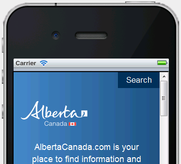
Depending on the size of the device images might be scaled or –as displayed on the screenshot- replaced by other images. - Texts
Difficult ;) Some people prefer to have the normal text that is also used on the “normal” web site, others like a shortened text and a “read more” link.

Button to jump to the navigation

Main navigation at the bottom of the page
Search hidden

Search visible
At the end mobile devices are an important factor that has to be considered. Mobile devices aren’t just fun, they enable business.
So… I hope this article provided some new information for you. If you have a WSM project that’s already based on a responsive design then make sure to update to version 11.2 and try the new preview. And if you plan to relaunch the web site of your organization then make sure to think about a responsive web design ;)
Source: Sneak Preview “Mobile Preview in WSM 11.2”
© copyright 2013 by Manuel Schnitger