- Internet
- 21.05.2019
- EN
Manuel Schnitger: WSM 11.2 - Focus on Mobility Pt. 1
written by Manuel Schnitger, 24. November 2013
Didn’t have the time to join Enterprise World or other recent events in order to find out what’s new in WSM 11.2? But keen on gaining insight into the mobile strategy of Web Site Management? No problem at all. In this and the upcoming blog posts I’ll write about almost everything that happened in the last couple of months. Some things are already available and others will follow at the beginning of the next year. All in all the new features, functions and other things point into one direction: Mobility.
Therefore I’d like to write a small series of posts about the following topics
- Responsive Web Design Project
- Mobile Preview
- Device Preview
- Mobile Frontend
- Xample Project
Responsive Web Design Project
Ok, let’s start with the RWD project! It’s been created based on the Twitter Bootstrap framework and is a project for the Management Server of WSM. If you should have an overview about the history of WSM and the products that have been provided over the years, then you’ll notice that WSM never provided projects. Of course the service guys created hundreds of projects in the last decade but a ready to use project? No, not until now!
But that changed with the release of the RWD project. As mentioned the project is a normal WSM project for the Management Server and it can be imported into the system as easy as any other WSM project. But what does it contains and what can you expect from the project? That’s pretty easy to explain. It comes with a few master pages that already have a multi-level navigation. In addition to that lots of modules which can be found in most state-of-the-art projects are part of the project: Images tiles, tabs, accordions, image galleries, videos and a lot of more stuff. So at the end the Twitter Bootstrap framework has been turned into a proper WSM project. Ready to use. And of course responsive. And especially the fact that the project is a responsive one really matters. So after you’ve imported the project, added your content and published it to your webserver your brand new web site can be viewed using every device. Be it a desktop browser or any mobile device.
Want to know, how it looks like? Here is a small gallery that gives you a first impression.
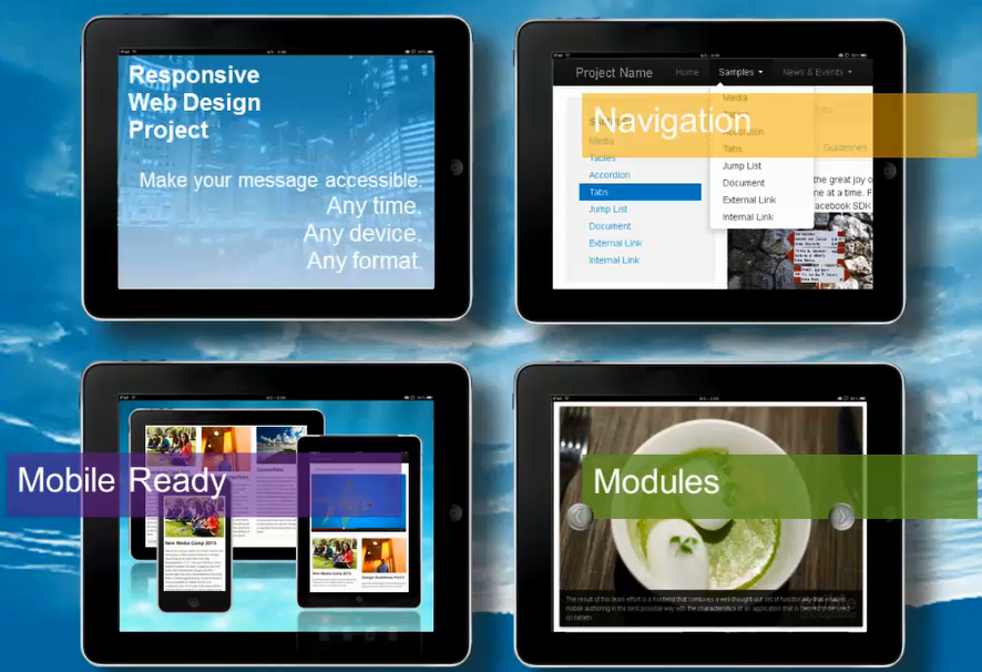
RWD Project Overview
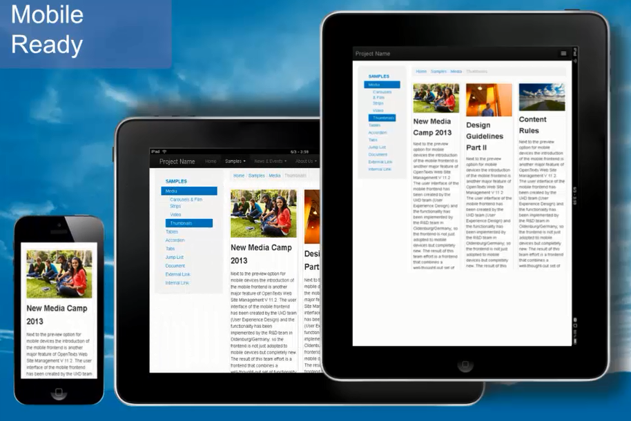
Works on every Device
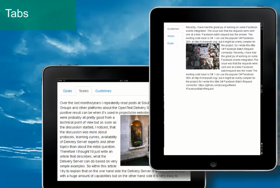
Tab Navigation (horizontal/vertical)
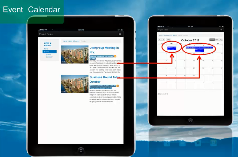
Event Calendar
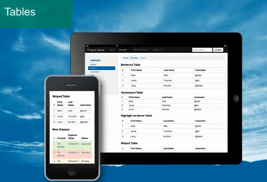
Tables in different styles
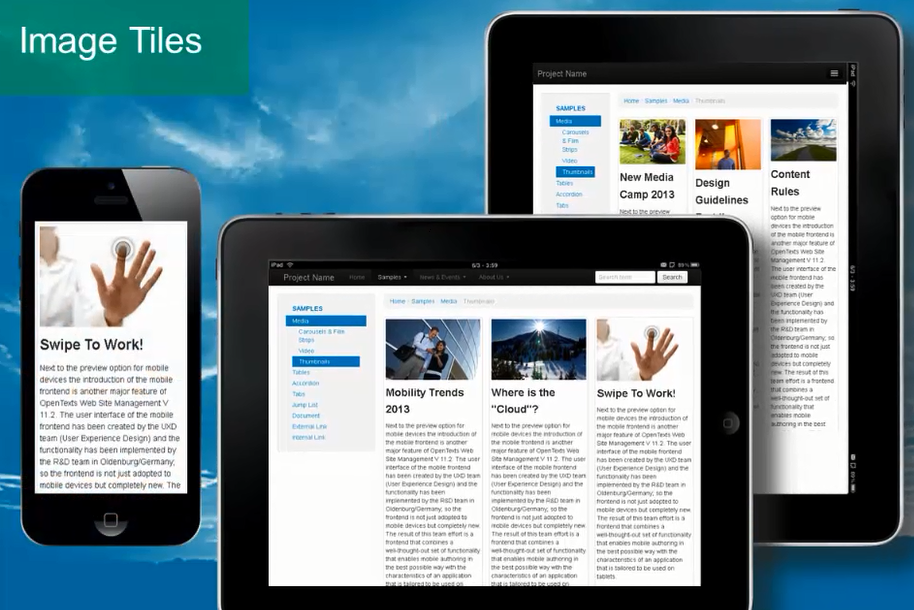
Image Tiles
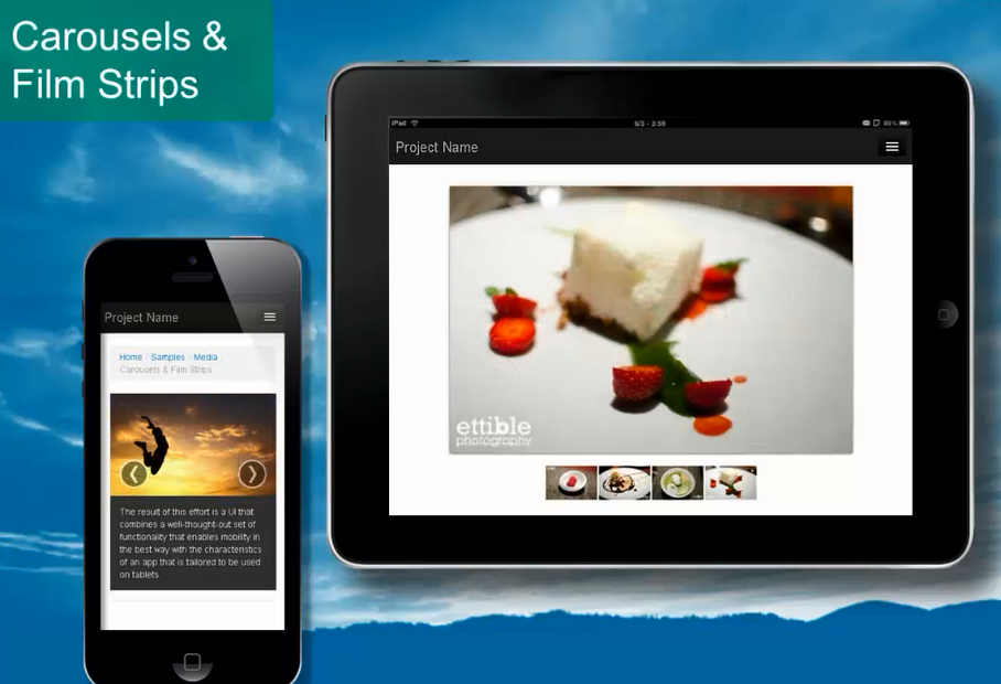
Image Galleries
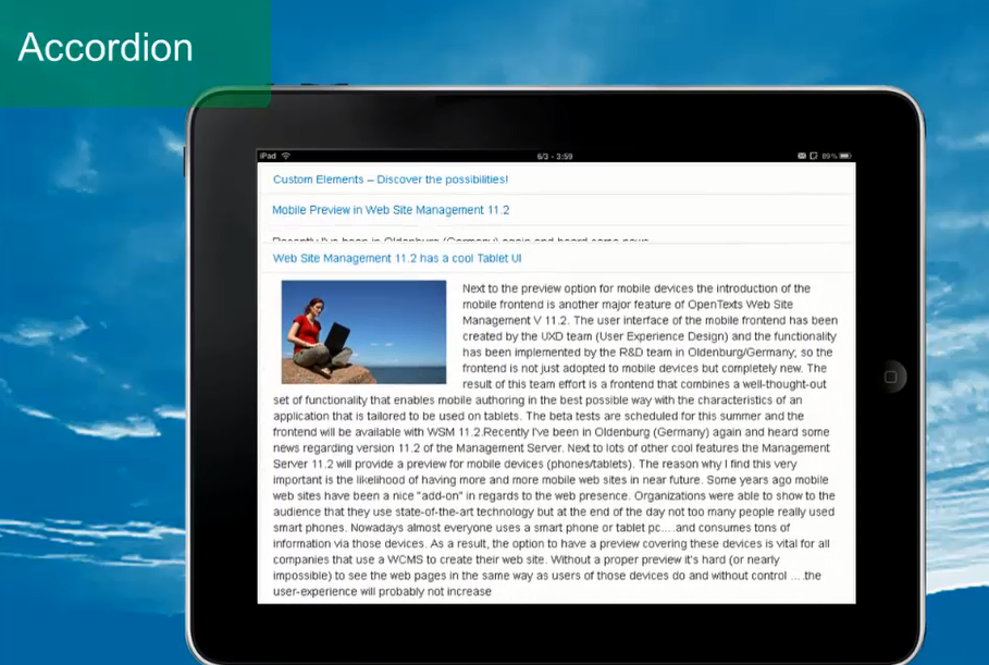
Accordion
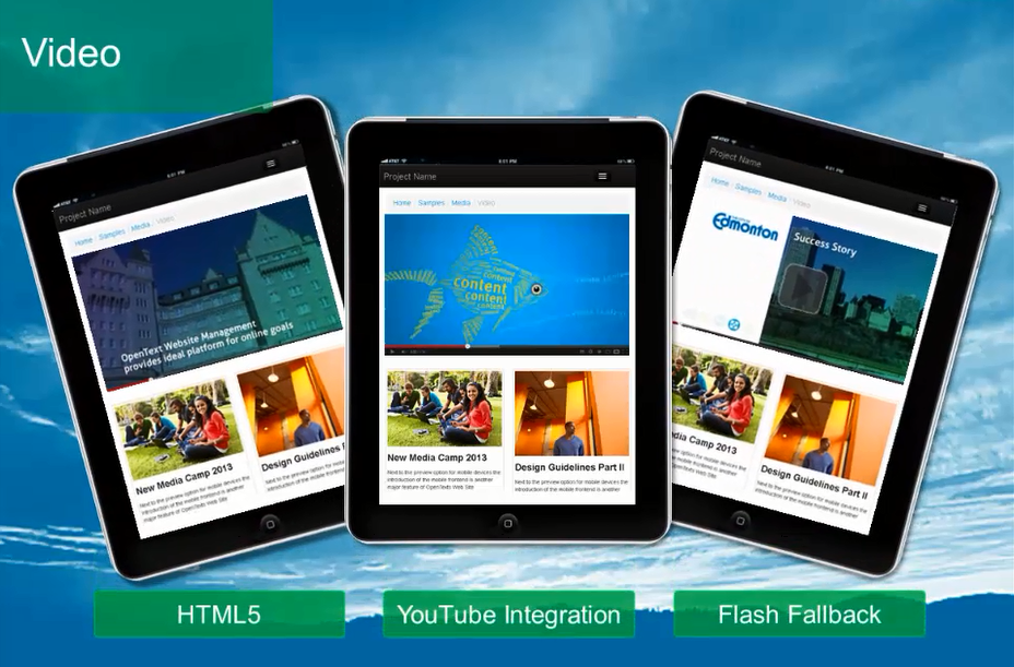
YouTube
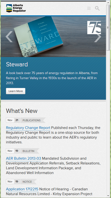
Real Live Example http://www.aer.ca
The cool thing about the project (and the framework it’s built on) is really that it’s so fast to create a website that matches exactly your design requirements…. without any changes to the content classes. And after a short period of time you can start to add your own content and that’s it. Of course we haven’t spoken about workflows, authorizations and other settings but that’s something general that has to be considered for every project. If you’re now interested how a web sites looks that uses this approach, then this site could answer some questions: http://www.aer.ca/
And if you now think: ”Well, that really looks great, but I want to join a live presentation and ask some questions”, then just contact the U.S. services team (asowsm@opentext.com ) or just drop me a line (manuel.schnitger@[TheCompanyIworkFor].com). I’ll get you in touch with the right colleagues.
Just to make one thing crystal clear: The guy on the photo at the top is not me ;) !
Source: WSM 11.2 – Focus on Mobility Pt. 1
© copyright 2013 by Manuel Schnitger