- Internet
- 16.01.2019
- EN
yellowpencil: Quickly prototype in-browser and responsive wireframes: Foundation vs Bootstrap
A 12 minute read, written by Brenna
August 27, 2015

Foundation vs. Bootstrap: Creating fast in-browser and responsive wireframes.
There are a variety of ways a UX designer can share their wireframes with colleagues and clients: UX sketches, Photoshop or Illustrator mockups, or tools like Axure for a little interactivity. Few of these, however, have the same impact as a working in-browser prototype. That’s where frameworks come into play.
What is a framework?
According to Awwwards, “A framework is a standardized set of concepts, practices, and criteria for dealing with a common type of problem, which can be used as a reference to help us approach and resolve new problems of a similar nature.”
There are a two general categories a framework can fall under – front-end and back-end frameworks, with subcategories within each. I’ll be focusing on front-end frameworks. Within front-end frameworks there are simple frameworks (frameworks that provide you with a well-designed grid) or complete frameworks (frameworks that come with all the CSS bells and whistles).
My initial intention of this article was to review a multitude of different kinds of frameworks in an attempt to see which was the most efficient for my wireframing needs. After testing out 15 different kinds, I was surprised to see how lacking most of them were when it came to design assets. On top of that, how many that had been cancelled or “set aside” by the founders to move on to other projects.
For the purpose of our in-browser, responsive, and most importantly, quick wireframing, I ended up with only two real contenders for the best framework. I decided to set aside my findings from the other frameworks and focus on Bootstrap and Foundation. It’s safe to say these are the most well-known frameworks out there. Let’s see how they held up against me: the basic HTML/CSS UX designer on a hunt to get out of Photoshop and get in browser!
First things first: I made a quick sketch for mobile and desktop.
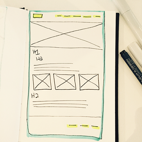
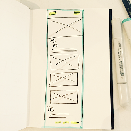
These sketches represent a rough idea of what I want for my desktop and mobile views.
- A basic header with five links
- Logo on the left
- Hero image
- H1, H2, and paragraph text
- Three images - that fall on top of each other for mobile
- A footer with three links
- For mobile: the classic hamburger menu with a slide out menu to show the five links.
I created three steps for what I wanted when it came to the perfect prototyping framework:
1) Give me ready code
I learned a quick lesson when testing the other frameworks. Downloading and opening a framework to a blank index.html page was not (for this use) what I wanted to see. I’m not a developer (though I have been learning some JavaScript!), so seeing the empty page means I have a lot more work to do before I can get started. My whole intention of using a framework is so that it will do all the work for me. I want to open up the index.html file and already have a basic template set up, ready for me to add things — something I can tinker with and build out my Frankenstein. Speed is important and with these frameworks, I want a “don’t make me think” mentality.
2) Resources and templates
The quickest way for me to Frankenstein is if a framework hosts a variety of templates on its site. Some of the frameworks I originally tested had no resources to work from at all. They basically just provided me with a static page telling me about their grid systems. This is ideal for other projects but not for what I was looking for.
3) Clear naming and a simple grid system
As you can see from my wireframe, I’m not looking for anything too fancy — I want to check out my sketches in a browser and have it ready if client or team member has any questions. Also, when you’re on a tight budget, it can be hard to find the time to do any kind of coding. So the faster I can prototype, the better. I found some frameworks used complicated or different naming systems for their grids. Not sure why they’d do this, but I usually would just give up on them. Ain’t nobody got time to go to your site and read through your copy just to figure out how to use your grid!
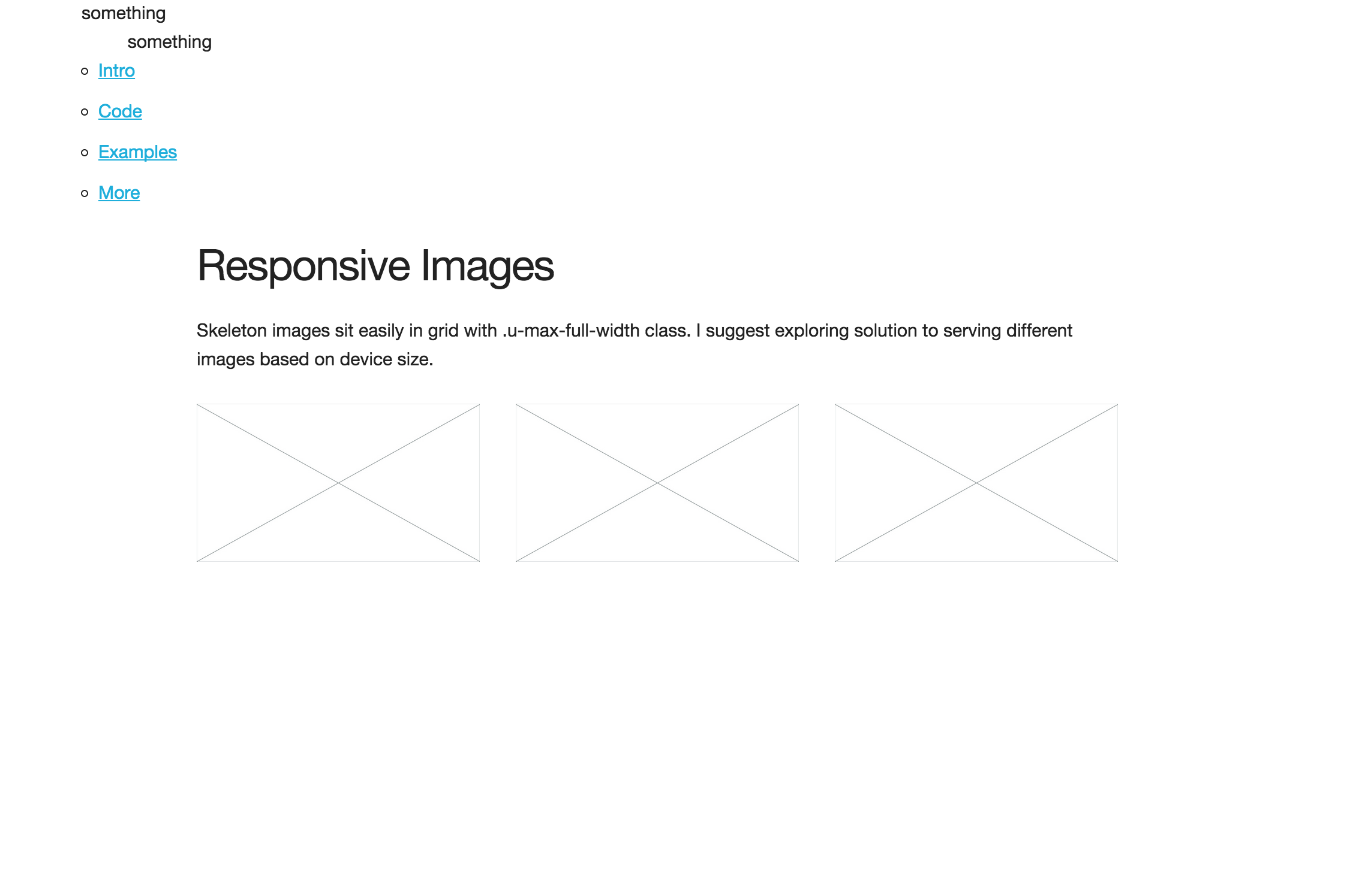
OK, before I compare Foundation with Bootstrap, I’d like to highlight another framework I tried. I’ve heard great things about Skeleton and was really looking forward to trying it out. Here is why it didn’t work.
Skeleton
It’s a responsive CSS boilerplate (framework) that advertises itself as “A dead simple, responsive boilerplate.”
When I downloaded it and started playing around a bit with what it had to offer, I was saddened.
Here is what I found:
Pros:
- Clean and open design
- Would be great for a minimal mockup of a static page
- Liked Skeleton’s type and general layout.
Cons:
- Skeleton’s “responsive” does not offer anything beyond the page just getting smaller. I wouldn’t recommend it if you have any kind of menu you would like to hide away for your mobile wireframe.
- It only offers one demo at the moment, - which is a one-pager and doesn’t feature too much besides some CSS hover overs.
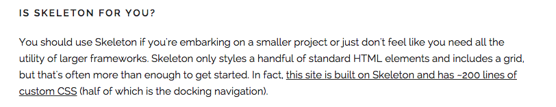
Responsive CSS is good. I would use Skeleton for a different project but, it’s not ideal for my wireframing challenge.
This is how far I got with Skeleton before I realized this wasn’t the framework for me:
That said, Skeleton did provid a disclaimer, that I saw after:
Many frameworks ended in the same results. But two stood out and let’s get started and see how they stack up against each other. Remember, I am, as they call in the www. world, a n00b. I can work around HTML and CSS for the most part; I feel confident, but am still, in the realm of development, a beginner. So we’re putting these to the test and hopefully the how-to is something anyone can follow along with!
ZURB Foundation
ZURB says Foundation 5 “is the professional choice for designers, developers and teams.” They offer offer a semantic, mobile first, customizable, and professional framework that is “the most advanced responsive front-end framework in the world.
All of this sounds great, let’s go through the checklist to see how it holds up.
1) Give me ready code
Foundation offers users four different choices to download, ensuring that you’ll get the right amount of code for your project needs.
- Complete: Grab this version of Foundation if you want everything in the framework in simple, vanilla CSS and JS.
- Essential: A simple, lighter version that includes typography, the grid, buttons, Reveal and Interchange.
- Custom: Include or remove certain elements and define the size of columns, colours, font size, and more.
- Sass: Foundation is built using SCSS, and you can work with it in the same way. Check out the instructions on the Install documentation page.
Since I’m going for out of the box, ready to go non-production code, I downloaded Complete. Right out of the box, file unzipped, I opened the index.html file in Chrome. Here is what Foundation provided me with:
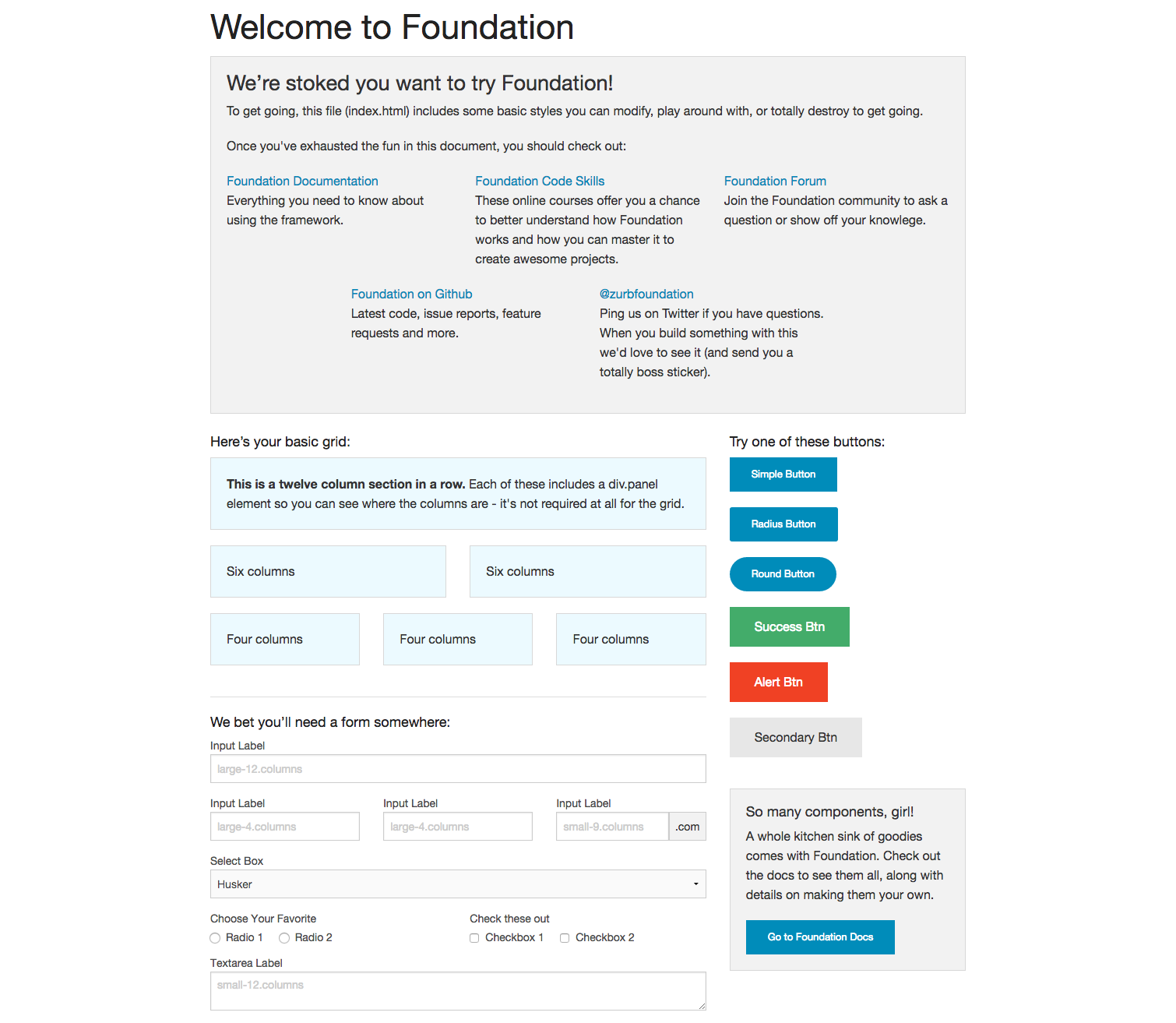
Thank you Foundation! This is fantastic because in this you see that the grids are already set up , the buttons have vanilla CSS so I don’t have to add it, and basically it’s a great “foundation” to get started with.
Now the real test: Let’s make the Chrome browser smaller and see how responsive it is compared to Skeleton:
I would call it OK. But not 100 per cent. The hamburger menu with the side navigation is missing. I’m going to have to do some hunting to find the right template. Hopefully Foundation offers more than one demo…
2) Resources and templates
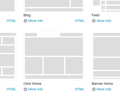
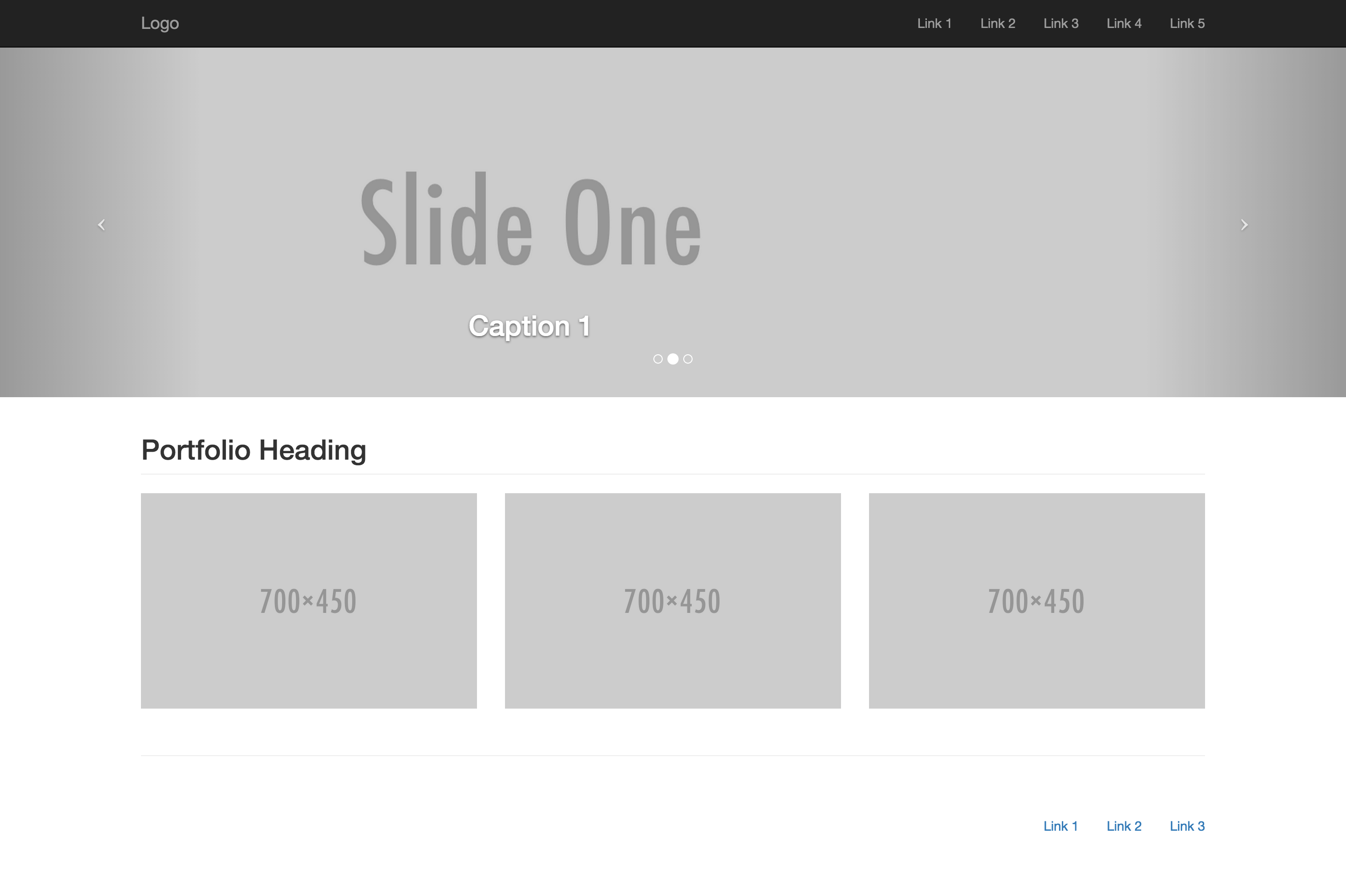
Foundation offers a variety of different templates to start working with, but Orbit-home is the best match to our wireframe.
Replace this HTML with what Foundation provided you in index.html.
Warning: Make sure you only delete the body HTML from your file. You’ll want to keep all of the default linking Foundation provided you with: css, javascript, etc
Your responsive wireframe should look like this now:
Pretty close to what I sketched! Considering I just downloaded Foundation and pasted in some HTML, I would call step 1 a success!
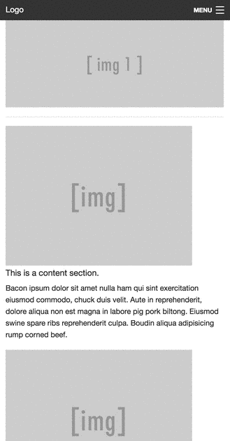
But what does this template look like on mobile?
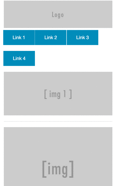
Not exactly what we want for our own design: still no hamburger menu on mobile. But Very close to our wireframes as far as the “bones” are concerned. We have image place holders, they’re stacking. We also have our footer links and navigation in place.
How am I going to get that hamburger menu? Grab the html out of this page
Replace these lines with the ones you copied:
Then clean up the HTML file to match our wireframe by:
- Making five links
- Delete the left link
- Change the H1 link to “Logo”
Your wireframe should now look like this:
Do you think Foundation passed step 2? Yep. I was able to look at its documentation and with some simple copy and paste, I now have a responsive menu.
3) Clear naming and a simple grid system
I’m going to start taking things out of the HTML and rearranging it so the body looks like the wireframe.
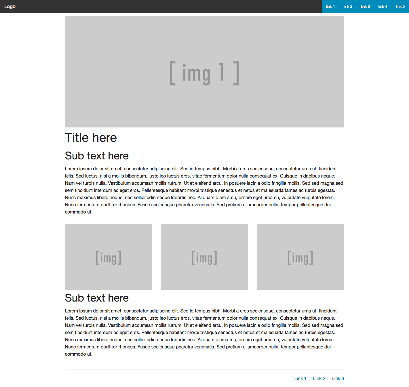
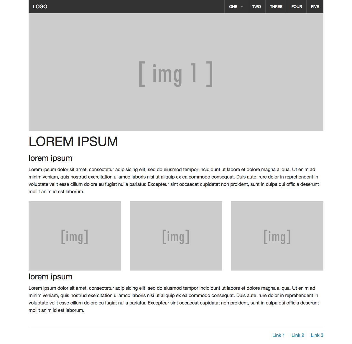
The wireframe consists of the following (in order from top to bottom):
- Header: logo and five links
- Banner image
- H1
- H2
- Paragraph text
- Three images in a row
- H2
- Paragraph text
- Footer: three links
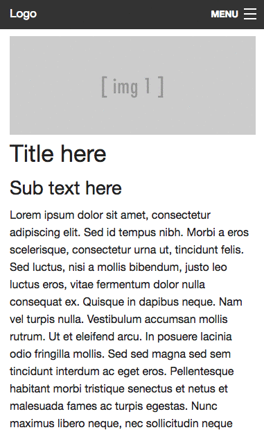
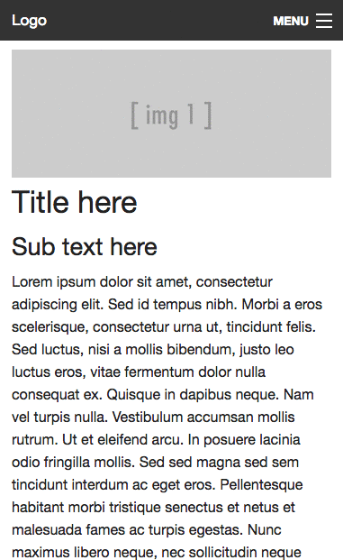
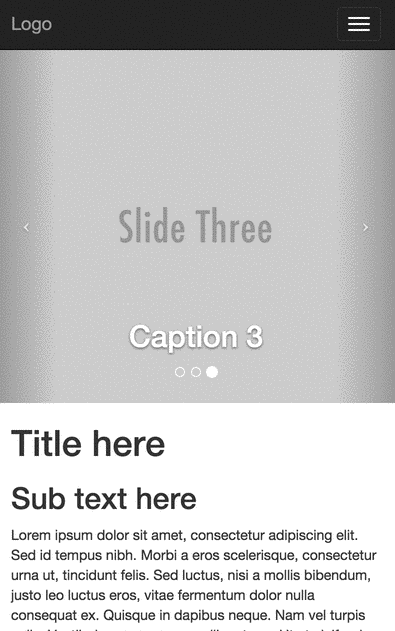
For mobile:
- Header: five links replaced with hamburger menu
- The banner image and text to size properly to the screen
- Three images to stack on top of each other
My first step is to start hacking away at some of the HTML I know I won’t need, like all the text under each of the images.
It should look like this when you’re done:
opcache.enable=1
opcache.max_accelerated_files=1024
opcache.memory_consumption=128
opcache.revalidate_freq=60
Delete the entire section about getting in touch and make your footer look like the wireframe by deleting the paragraph text about copyright and add a fifth link to your unordered list.
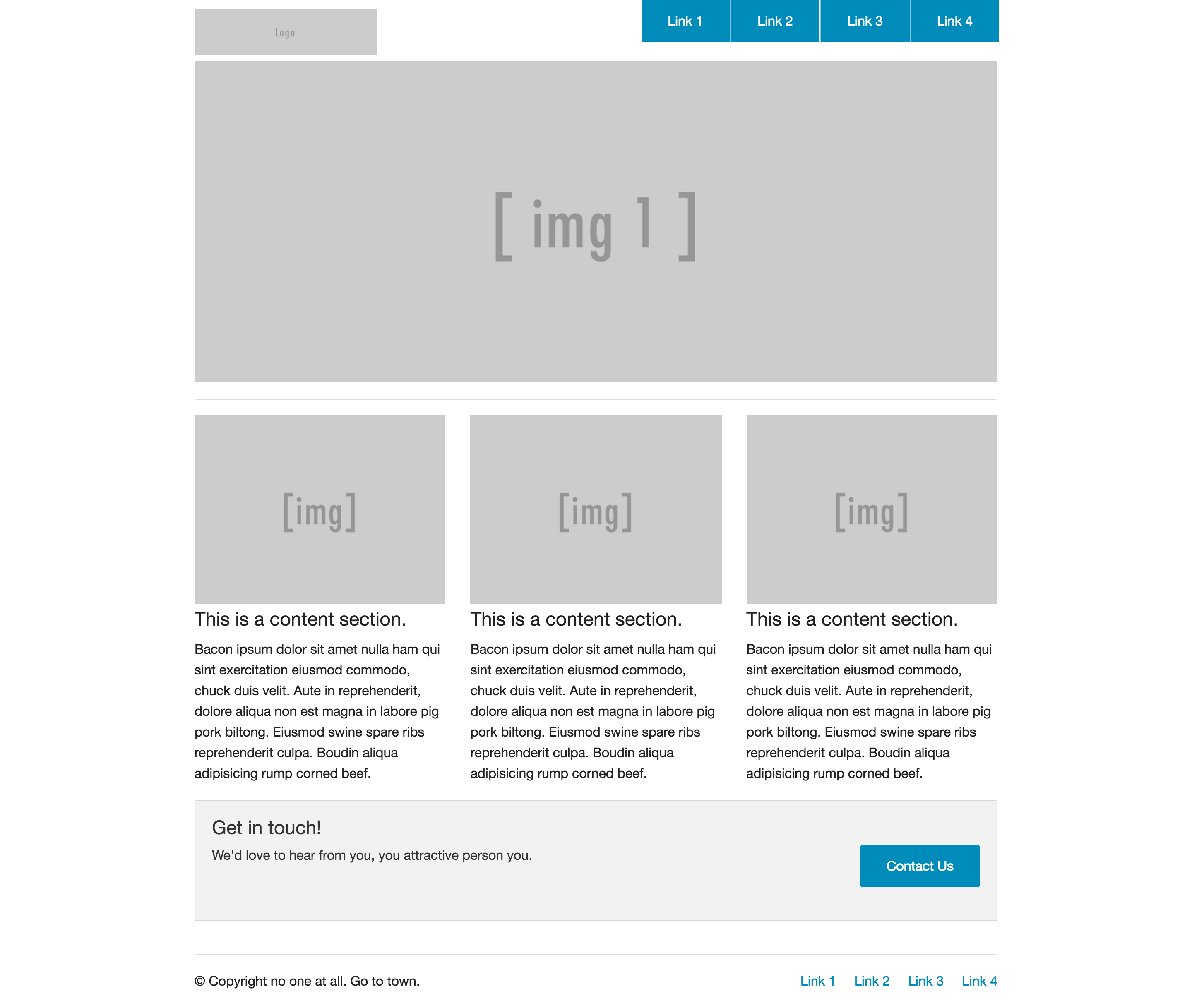
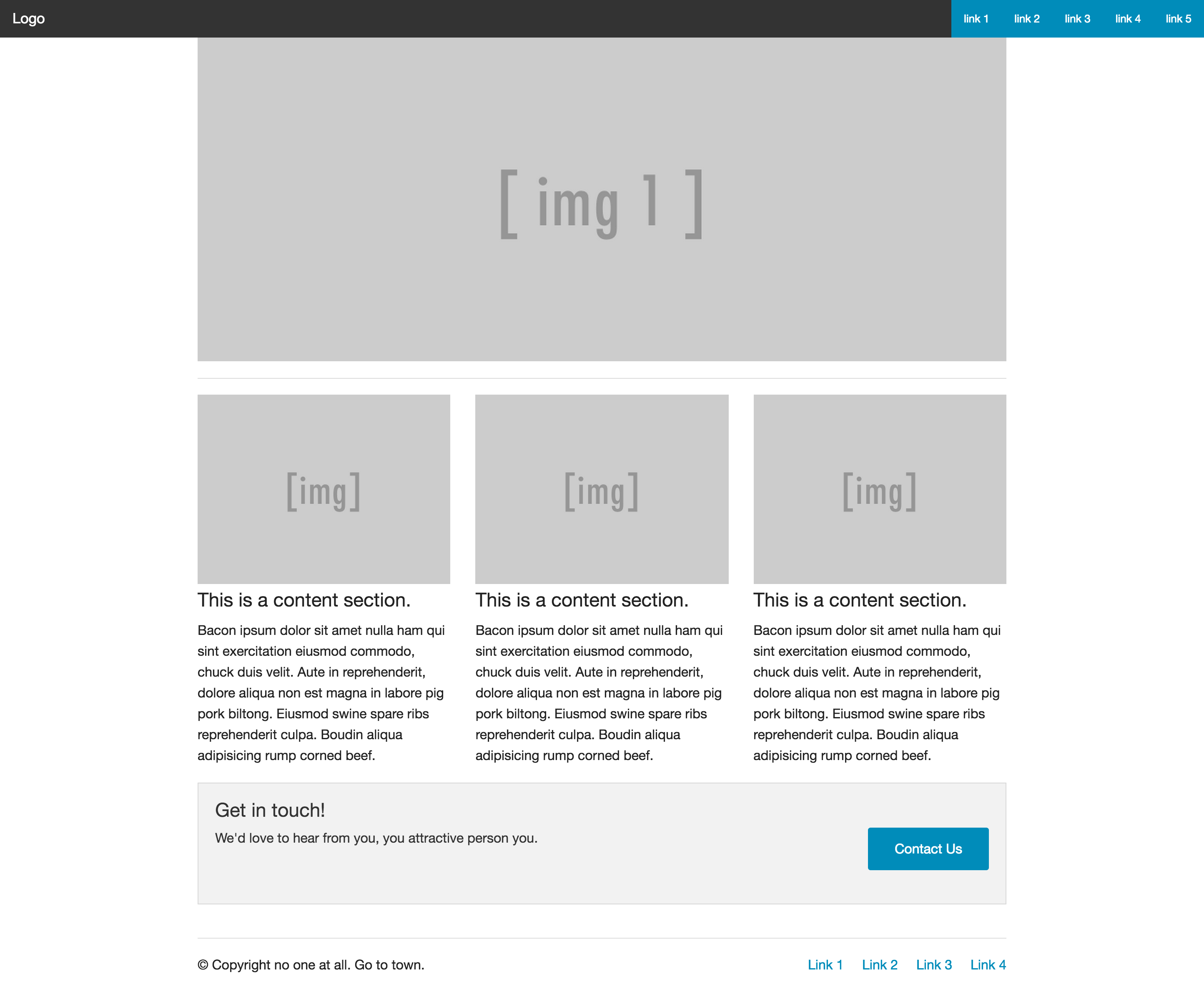
Your wireframe should now look like this:
Almost done! Now add the appropriate H1, H2, and paragraph text place holders that are in the wireframe. You will want to use the large-12 column grid for these.
Here is what your in browser responsive wireframe should look like:
Total time: 14 minutes
That’s pretty good for a beginner on a time crunch! Now I can show the client what I have in mind for the home page’s mobile view or riff with the visual designer on my team about what assets we’ll use for that hero image!
Bootstrap
Bootstrap defines themselves as “the most popular HTML, CSS, and JS framework for developing responsive, mobile first projects on the web.”
That’s a big statement but for what we’ll be using bootstrap for, its pretty similar to Foundation.
Both are responsive. Foundation takes a “mobile first” approach, where Bootstrap takes an “all devices are created equally!” approach. Bootstrap also seems to focus on its technical capabilities right away. Which I appreciate.
So let’s download and see how it measures up!
1) Give me ready code
I downloaded Bootstrap, unzipped and no index.html file. I was suprised to see this, since they advertise as “the best framework in the world” but after exploring their site more, I found another disclaimer:
Ok, looks like Bootstrap relies on users to navigate its site to find the source code they’ll want to work with. Hopefully Bootstrap has a strong template. What does it matter when I just replaced all of the starter HTML with Foundation?
It means a couple of things. When a framework provides a demo file on download I know exactly what I have access to! Show me that I can have this button and tell me that this is how you frame a three-column grid! When you don’t provide me with anything at all, you’re making a big assumption that I’m going to want to hunt for it. Well Bootstrap would be right — I am going to hunt for it. But I wouldn’t say they passed this section.
2) Resources and templates
Bootstrap, like Foundation, offers a large variety of different templates.
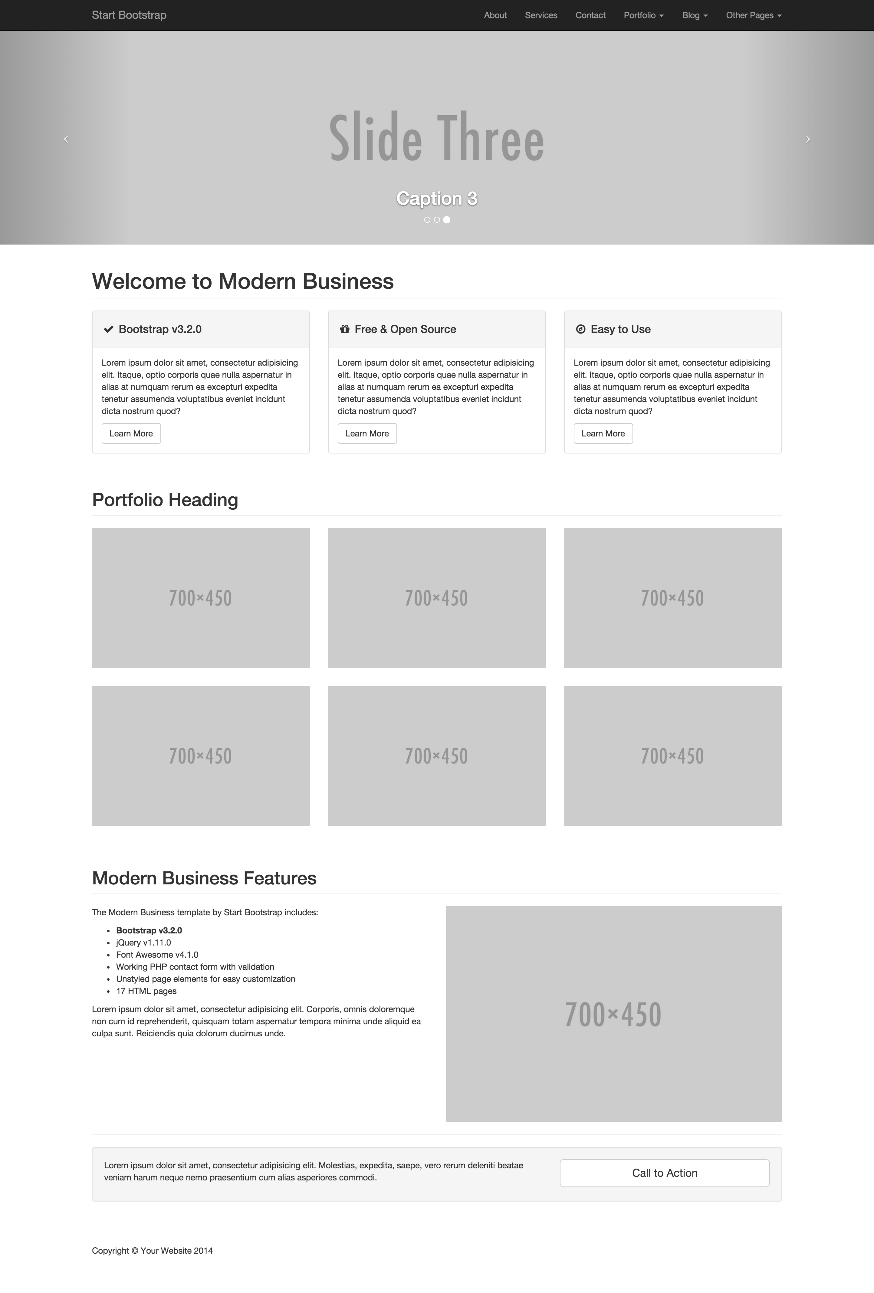
The one that fits our wireframe the closest (almost perfectly) is called Modern Business.
Mobile view:
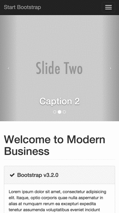
Fantastic! Looks like Bootstrap passes step 2 with flying colors! We have a hamburger menu, our images are stacking, and I basically just need to cut out the code that I don’t need and add the H1, H2, and paragraph text!
3) Clear naming and a simple grid system
When you take a closer look at the HTML, you’ll see there is a bit of editing to do. This Bootstrap template is so extensive that all of the links actually link to other HTML files. Since you’re not working with these files, you’ll want to go in and start hacking away at the code. Make sure you take out the lines you don’t need and delete any unnessacary links.
Then change the names of your header links and site title, make sure you delete the drop down menu (or mark it out in case you’ll want it later.)
Your header should like this now:
Now it’s time to start shaping the body of your wireframe:
- Delete the entire “Marketing icons” section.
- Delete all but three of the images in portfolio.
- Delete the entire “features” section.
- Delete the entire “call to action” section.
- Copy the UL lines in your header.
- Replace the <p> copyright line with the UL script.
- Delete two of the LI from this.
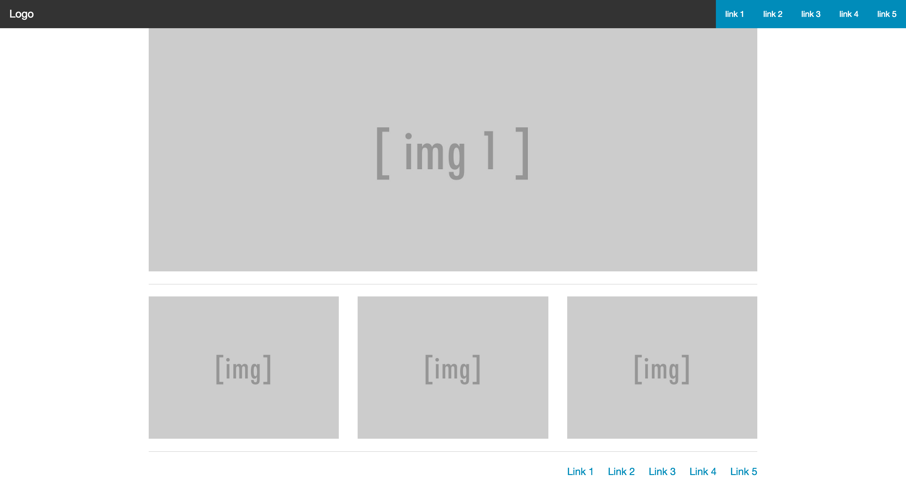
Your desktop wireframe should now look like this:
Now add your H1, H2, and paragraph text.
Looks like Bootstrap passed step 3 with flying colours!
Your final wireframe should look like this:
Total time: 11 minutes
I cut the time by three minutes! Although Bootstrap at first did not provide me with any copy, it didn’t matter because its templates were so extensive and detailed. I ended up with more HTML then I needed and cutting out is always faster than writing when it comes to quick iterations.
Foundation vs. Bootstrap – which wins?
Essentially, if you’re looking for a framework that will save you tons of time, and you don’t need any of it to be production-worthy — I would recommend both! Foundation has great documentation and resources. Bootstrap is quick, fast, and extensive when it comes to its template library. My advice is to always sketch your wireframes first — get your thoughts and ideation out. Then, when you’re ready to prototype, compare the templates against each other: one is bound to have something you’re looking for!
Source: Quickly prototype in-browser and responsive wireframes: Foundation vs Bootstrap
© copyright 2015 by yellowpencil