
- Internet
- 04.06.2019
- EN
Manuel Schnitger: WSM 11.2 - Focus on Mobility Pt. 2
written by Manuel Schnitger, 9. December 2013

Mobile Preview
If you have a responsive web site or plan to create a responsive web site (maybe even based on the RWD Project), then this is a very good idea. Nowadays responsive web sites are more or less a must have. And if you have a look at the Top HTML5/CSS3 frameworks (Twitter Bootstrap, Foundation, Skeleton, HTML Boilerplate, HTML Kickstart , etc.) then you’ll figure out that all of them are responsive. So it seems to be not just a trend but a fact that web sites are produced to be consumed on mobile devices (, too).
But a responsive design -based on HTML and CSS- is just the technical foundation of a web site. So the responsive design takes care of different sizes of browsers, it resizes images and texts, let’s columns float, adopts user interface elements to the device the visitor uses and so on. But next to this the editorial work has to be considered ….and checked.
You ask yourself why the editorial work has to be checked even if you have a responsive web site? That’s pretty easy. Sometimes the technology behind the web site works perfectly fine but the result is still not what you expected.
Examples:
- On an image, that looked very good in a normal size on a desktop browser, you cannot identify anything after it has been resized and is displayed on a mobile device.
- An editor just used copy and paste in order to insert a url (e.g.: http://www.mycompany.com/products/summerfashion/beachwear/short/) instead of assigning the url to a word (Beachwear ;-)) within the text. The result is, that the url is displayed completely without a line break and you’ll see a horizontal scroll bar. Not very impressive ;)
- A video player that looks normal on a desktop browser is just displayed partly on a mobile device.
- Forms are scaled down and the end user cannot really fill in the required data. Or at least he is annoyed.
- Tables -which show very helpful information- are much smaller and can just be seen in an acceptable way if the user makes the whole page bigger and scrolls from left to right and from the top to buttom.
I could add some more examples but I think it’s pretty clear that it’s very helpful not just to check whether a page looks great on a desktop browser but also if it makes the same good impression on mobile devices.
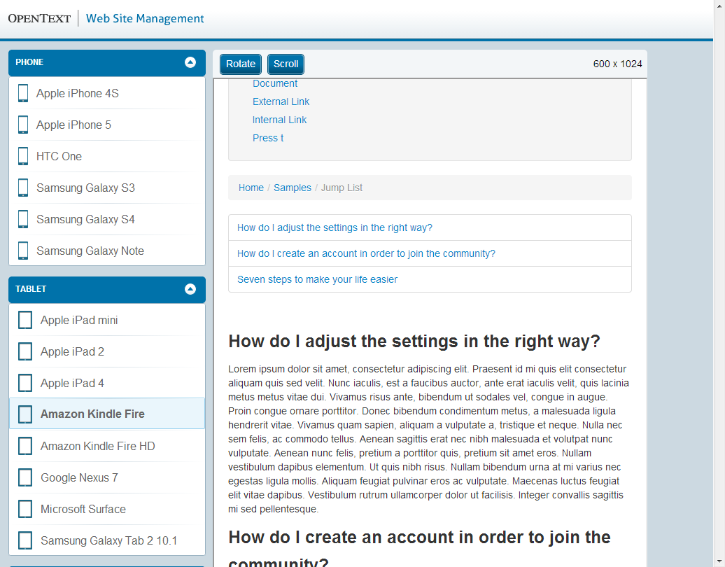
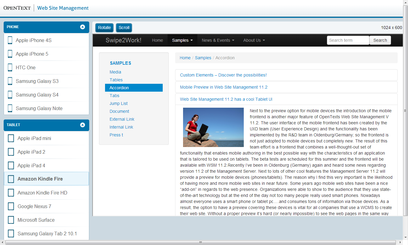
WSM 11.2 supports this process with the new Mobile Preview. It can be called via the context menu of a page as you know it from opening the normal preview. (Screenshot #1). Once the preview window is open, you can choose one of the devices shown in the device bar (on the left hand side) and the size of the window will change accordingly. This way you can make sure that your web presence can be consumed on each and every device or just focus on the ones that are most likely used by your target audience. Next to mobile phones you can also select different tablet pc’s as well as desktop monitors for your tests. And if you wish to use other devices then you can add them easily. Just open the file mobileConfig.json that you can find in the directory <Management Server installation directory>\MS\Web\MobilePreview, add your new device and ready you are! (Hint: If you use a clustered environment, then you have to copy the mobileconfig file to each of the cluster nodes.) As lots of devices provide the option to change the orientation from portrait to landscape there is a button at the top of the window that exactly allows you to do this. And if you wish to scroll, then just click on the scroll button and the scroll bar appears.
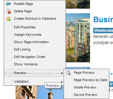
Mobile Preview can be called via the context menu in SmartEdit
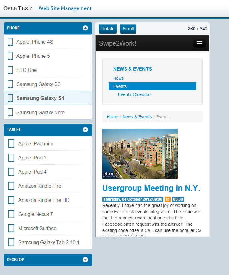
Samsung Galaxy S4
Amazon Kindle Fire
Amazon Kindle Fire
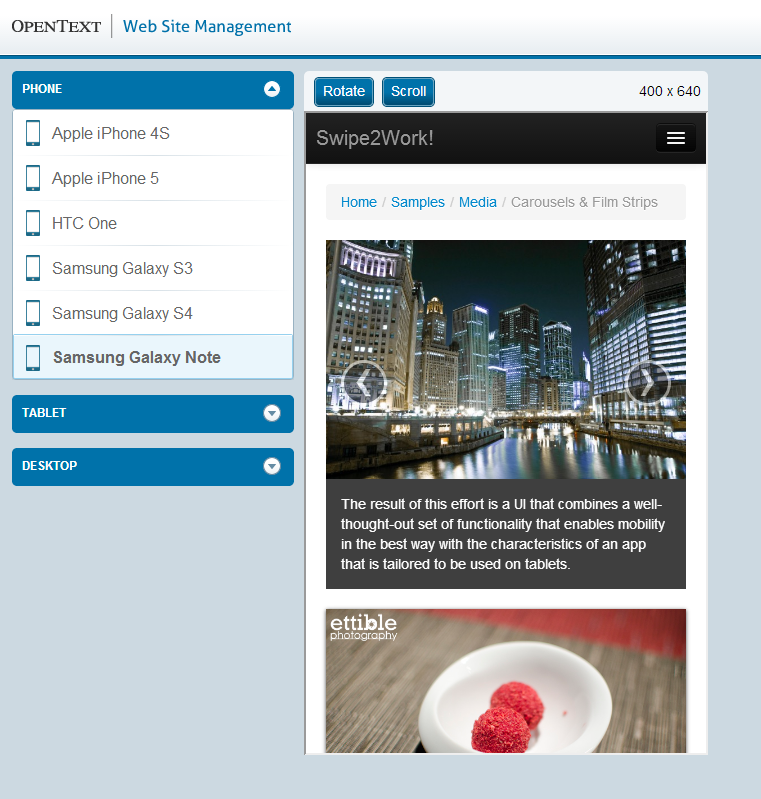
Samsung Galaxy Note
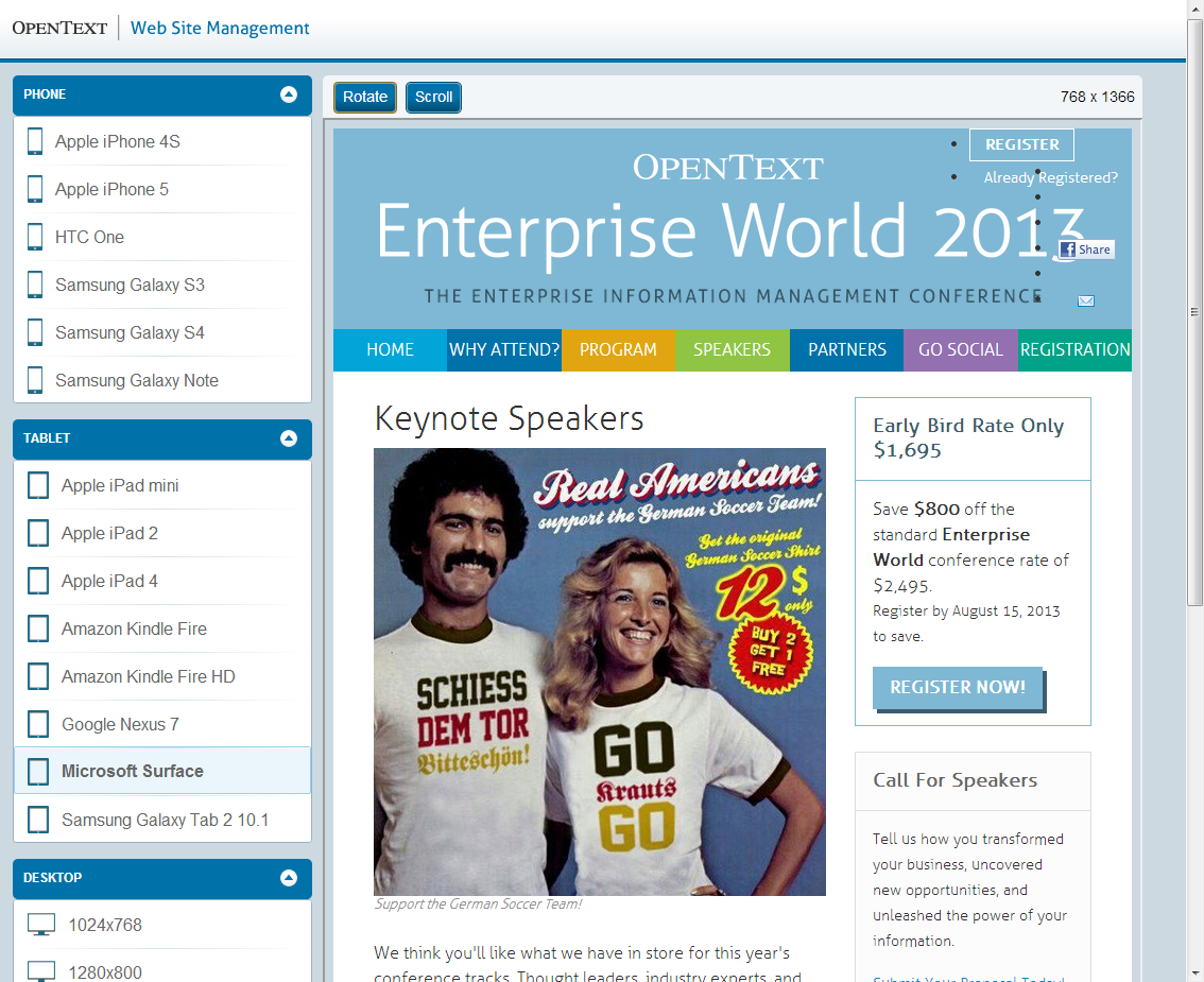
Microsoft Surface
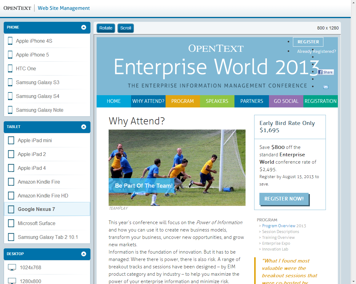
Google Nexus 7
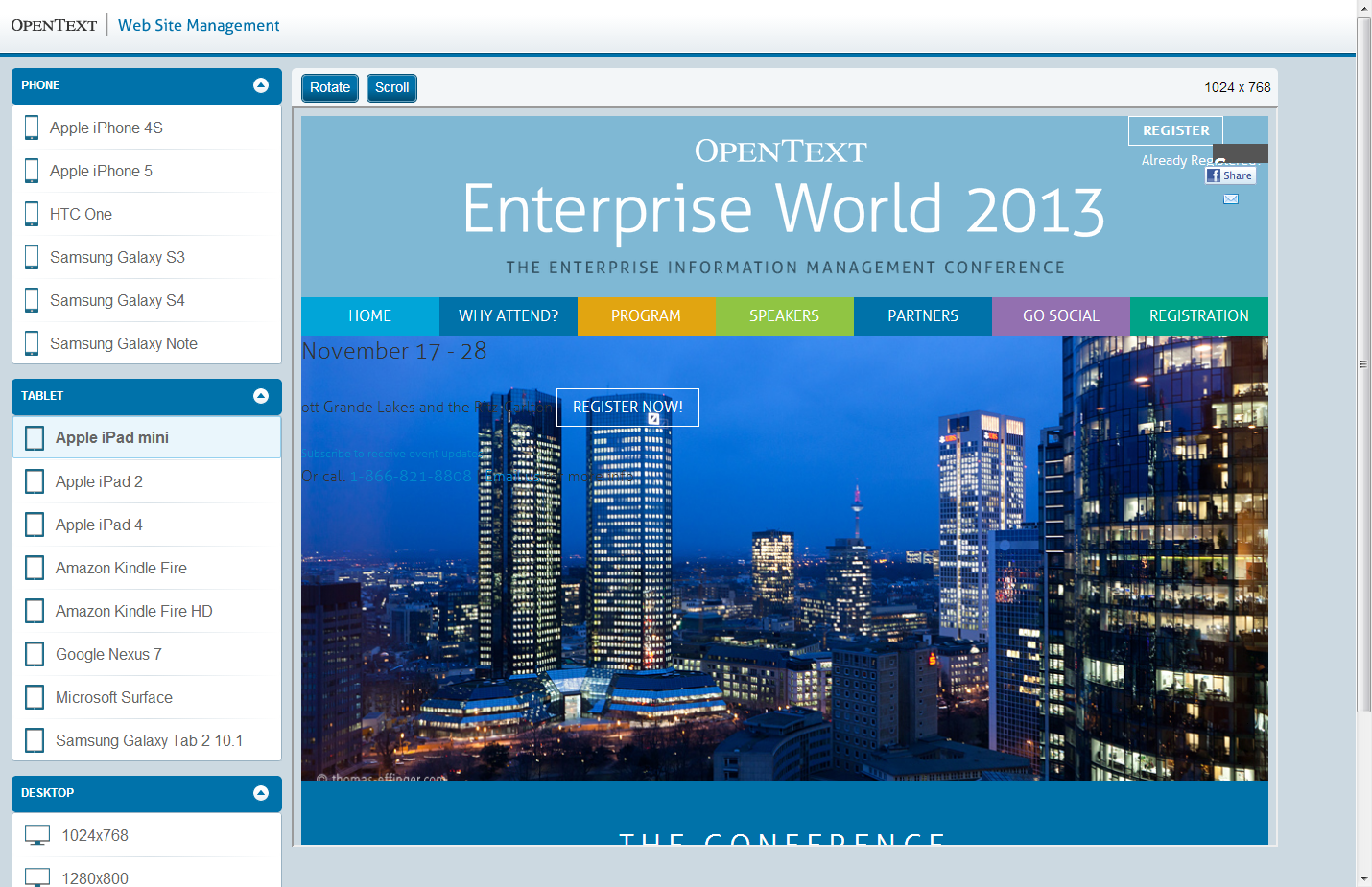
Apple iPad mini
After all checking how pages behave on mobile devices or different monitors is not just a goodie but an obligatory step whithin the editorial process and within the daily editorial work. The reason is very simple: If you paid money for a responsive website in order to provide a great user experience on mobile devices and engage your target audience then it would be counterproductive not to check the website before publishing.
Source: WSM 11.2 – Focus on Mobility Pt. 2
© copyright 2013 by Manuel Schnitger